Website Accessibility Basics for Small Businesses and Nonprofits
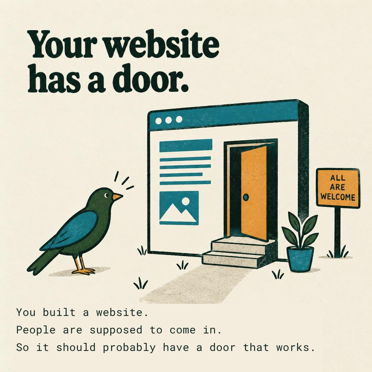
Website accessibility means building a website that people with disabilities can use, including people who are blind or have low vision, can't use a mouse, or have color blindness. For most small business, nonprofit, and school websites, it comes down to five basics: keyboard navigation, readable color contrast, descriptive alt text, clear heading structure, and forms that make sense. Here's what each one means and a quick way to check your own site.
Or, put another way: you built a website so people would come in. It should probably have a door that works.
None of this is glamorous. It is useful, though, and useful is kind of the point.
I've studied web accessibility through W3C's Introduction to Web Accessibility course, and these basics are where I start on every website I build.
Keyboard navigation: some people don't use a mouse
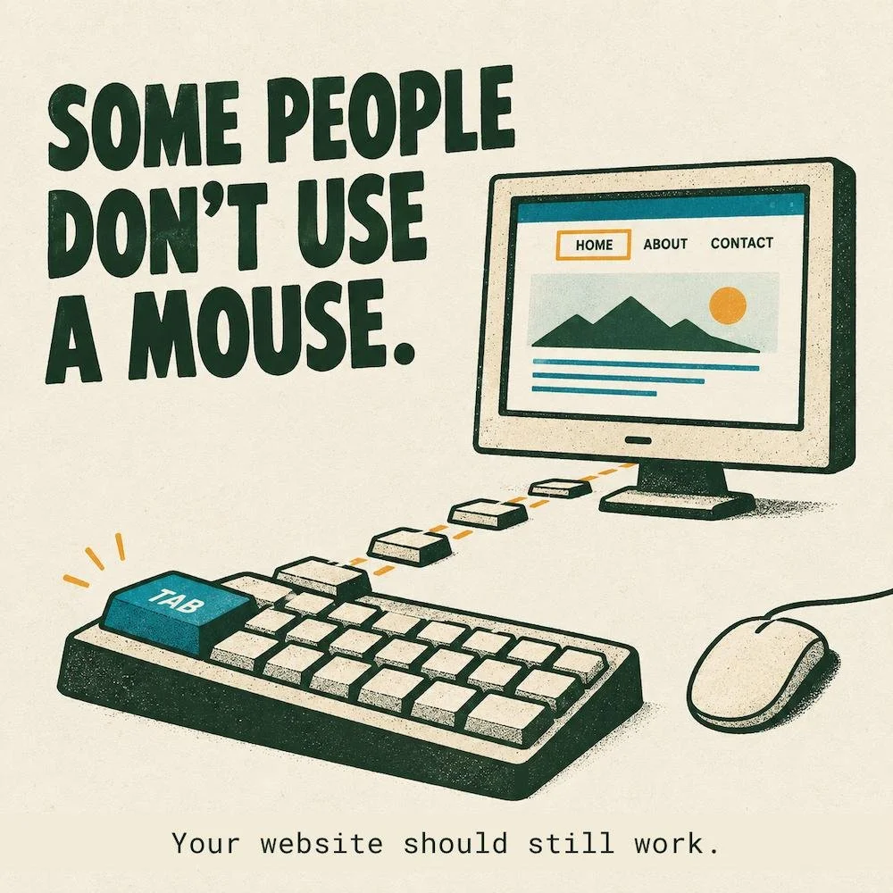
Keyboard navigation means someone can use every part of your website with only a keyboard: moving through links with the Tab key, pressing buttons with Enter, and opening menus without a mouse. Some people browse this way every day. Others use switch devices, voice control, or other assistive tools that rely on the same keyboard access.
Here's a quick test I run on every website I build. Put the mouse away and try to use the site with only your keyboard. Can you:
Tab through the page in a logical order?
See where you are as you move?
Use buttons and links with Enter?
Open and close menus?
Fill out and submit forms?
If any answer is no, your website has a door, but the doorknob is decorative.
Color contrast: technically readable, if you squint
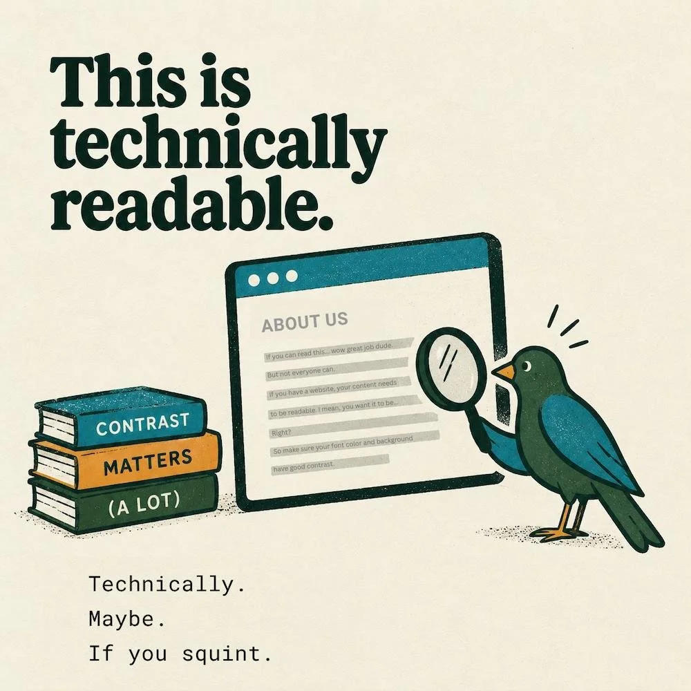
Color contrast is the difference in brightness between text and the background behind it. Under WCAG, the international web accessibility guidelines, regular body text should have a contrast ratio of at least 4.5:1, and large headings at least 3:1. Free tools like the WebAIM Contrast Checker will tell you in seconds if your contrast is adequate.
Good contrast makes content easier to read for people with low vision or certain types of color blindness. It also helps everyone else when:
You're outside and the sun is blinding
Your screen is dimmed to save battery
Your eyes are tired from a full day of staring
Your brain has a lot going on in the mind palace
Your brand color is not automatically a text color. A soft sage or a pale yellow can look beautiful on a button and still be hard to read as a paragraph. I recently adjusted my own brand teal by a hair so it would pass WCAG 2.1 level AA standards.
Designing for people who need good contrast makes your website better for everyone else too.
Alt text: a screen reader can't see your kitchen
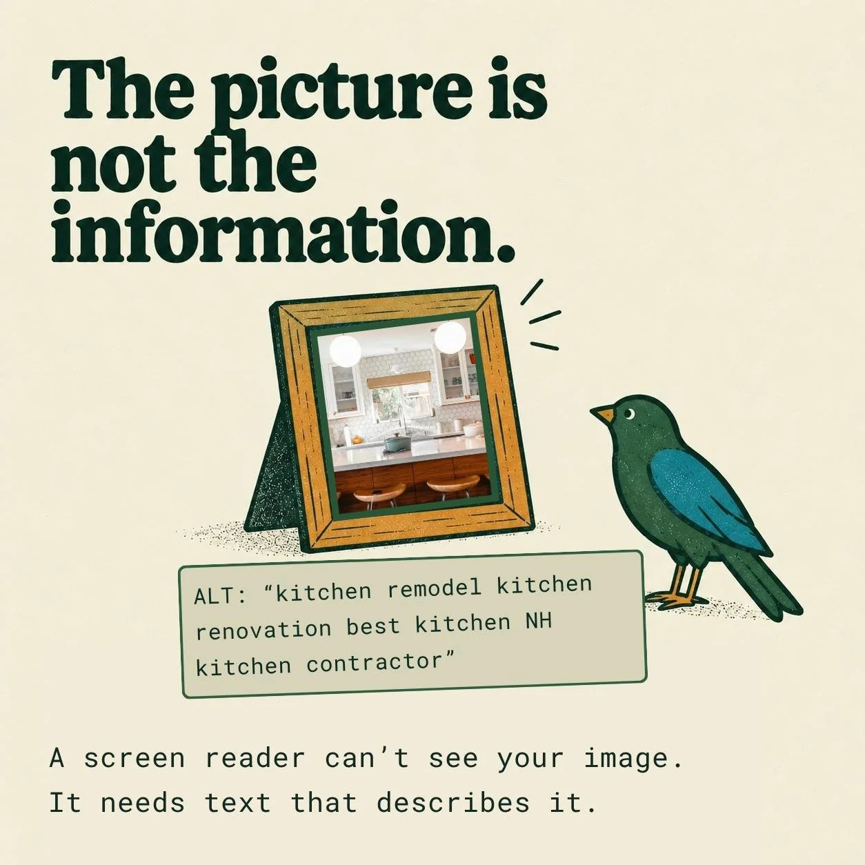
Alt text is a short written description of an image. Screen readers read it out loud or turn it into braille, so people who can't see the image still get the information it carries.
Screen readers can read your text all day long. What they can't do is look at a photo of your latest kitchen remodel and think, "Wow. Nice kitchen."
Here’s what not to put for alt text:
IMG_4827.jpg
"Kitchen"
Here's what truly helps:
"Kitchen with white oak cabinets, a large island, and windows overlooking the backyard."
The test I use: if the picture disappeared, what would someone need to know?
A few quick tips:
Skip "image of" or "photo of." The screen reader already announces that it's an image.
Describe what matters for that page, not every detail.
Write it for people first. Stuffing it with keywords makes it harder to listen to and won't do your SEO any favors.
Purely decorative images can have empty alt text so screen readers skip them.
Squarespace gives you a place to add alt text to your images. It takes a minute per photo, and it makes a real difference for the people who rely on it.
Headings: big text and headings are different things
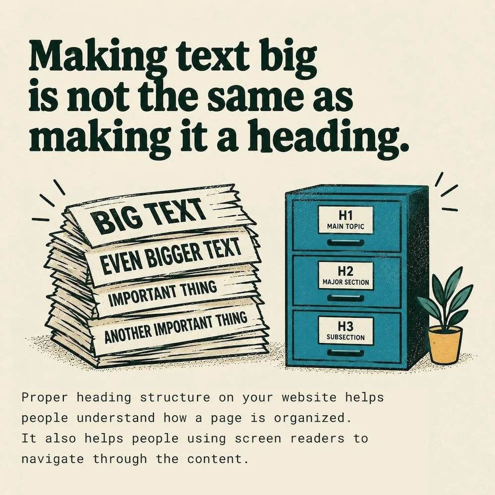
Headings (H1, H2, H3) give a web page its outline. People using screen readers can jump from heading to heading to find what they need, the same way you'd skim a page with your eyes. Search engines and AI tools read that outline too, to understand what your page is about and which parts answer which questions.
A healthy outline looks like this:
H1: the main topic of the page (just one)
H2: a major section
H3: a subsection under that
When I design a website, heading structure is what I use to organize the content. Most visitors never notice it. Screen reader users notice right away.
On some websites I have noticed that every piece of big text is an H1. Or a heading was picked because it was the right size. There may be three H1s in a row, then an H4 because the font size looked nice and small.
To someone using assistive tech, that page reads like an unstructured wall of plain text.
If you're on Squarespace, the fix is simple. Choose the heading level based on where the text fits in the outline, then adjust how it looks in Site Styles.
Accessible forms: ask clear questions
An accessible form is one anyone can fill out and submit, including people using a screen reader or only a keyboard. That comes down to four things:
A clear, visible label on every field
Required fields marked in text, not by color alone
Error messages that explain what went wrong and how to fix it
A path from the first field to the submit button that works without a mouse
A contact form seems simple. Name, email, message.
But a field with no label might be announced by a screen reader as "edit text," and nothing else. Good luck guessing what goes there.
One common shortcut is using placeholder text (the gray hint inside a field) as the only label. It disappears the moment someone starts typing, and some screen readers skip it entirely.
Accessibility beyond the checklist
Accessibility is about how real people experience your website: whether they can understand it, get around it, interact with it, and finish what they came to do. The five basics above are where that starts.
Contrast, alt text, keyboard navigation, headings, forms.
These five basics are a starting point. The full standard most organizations aim for, WCAG 2.1 Level AA, includes about 50 requirements, from captions on videos to text that still works when someone zooms in to 200%. If you want to see the full list, W3C's How to Meet WCAG quick reference covers every requirement and lets you filter by version and level.
Website accessibility FAQ
Does website accessibility help SEO?
It can help indirectly. Clear headings, descriptive alt text, and well-organized content make it easier for search engines and AI tools to understand your pages. No single change guarantees rankings. Still, the same structure that helps screen readers helps search engines too.
Is Squarespace accessible?
Squarespace gives you a solid starting point, with heading levels, alt text fields, and form labels built in. How accessible a site ends up depends on how it's built: the colors you choose, how headings are used, and whether images get real descriptions.
What is WCAG?
WCAG stands for Web Content Accessibility Guidelines. It's the international standard for web accessibility, published by the W3C. Most accessibility checklists, including the contrast ratios in this post, come from it.
How can I check my own website?
Start with the quick tests in this post: tab through a page with your keyboard, run your colors through a contrast checker, and look at the alt text on your images. Free tools like WAVE can flag other common issues.
Accessibility helps more people use your website
That's really what all of this comes down to. More people can find your information, understand it, get in touch, book a call, buy something, or sign up.
Accessibility is good web design. Good web design should make things easier for the people who use it, and that includes all of them.
Every website I build starts with these basics baked in. If you'd like a second set of eyes on your current site, get in touch and I'll take a look.